Semantic Color Math: Nuance Over Precision
Quaternion color geometry, hidden-state sequence models, and the honest limits of both.
Validity & Protection Statement
Every color, quaternion, and sequence on this page is a way of naming something, not measuring it. The goal throughout is accuracy of perspective — finding language that's honest to how a color, a feeling, or a traversal actually sits in relation to the others around it — not a claim that any of this identifies a true, fixed class. Where a figure looks like a classifier (a decision tree, a confusion matrix, a similarity score), read it as a description of closeness, not a verdict.
That distinction has real limits, and naming them here is part of the method, not an apology for it:
Lossy by construction
Any centroid, cluster mean, or similarity-weighted blend of real anchors collapses information by construction. It's a legitimate way to explore where something sits; it is not evidence of what something is.
Incomplete anchors
Two of the fifteen La Matrice colors have no hand-written anchor words, and the Procrustes alignment underlying the text-to-quaternion mapping is fit on the other thirteen — tight, but low-degrees-of-freedom. It generalizes; it doesn't prove.
Two geometries, two notions of closeness
The CIELAB ΔE confusion matrix and the Bloch-quaternion geodesic distance measure different things — perceptual difference versus hue-phase difference. Where they agree, that's meaningful convergence. Where they don't, that's the geometry telling the truth about what each metric can and can't see.
Embedding is a proxy
Sentence-transformer similarity to anchor text carries its own training-data blind spots, and the deterministic word-overlap fallback is cruder still. Both stand in for semantic closeness; neither is semantic closeness.
Memory choice changes the reading
The same traversal produces measurably different hidden-state trajectories under embedded versus delay memory. That divergence is reported directly rather than averaged away — a method that only shows its confirming half isn't nuanced, it's precise in disguise.
The sample is small
Fifteen colors, seventeen traversals, nine classification classes. Every pattern here is a real pattern in this dataset — not yet a claim about color, emotion, or wellness beyond it.
Nuance Spine
Every model on this page answers the same underlying question differently: when a color, or a feeling, sits close to another one — Orange near Brown, Blue near Violet, "curious" near "distrust" — do you force it into one answer, or do you let the closeness stay legible?
My Machine Learning midterm answered that question with numbers before I had language for it. An Indicator Model — sixteen colors, each forced into a single one-hot anchor — scored worst for prediction ability. A Random Forest reading the same colors as continuous, normalized RGB predictors, letting Orange and Brown sit near each other in feature space instead of separating them by decree, scored best. The confusions the precise model was penalized for — Blue↔Violet, Brown↔Red, Black↔Brown — turned out to be real, geometric, and predictable in advance from CIELAB distance alone. They weren't noise. They were the data telling the truth about how close those colors actually are.
That's the spine of everything that follows: a precise reading collapses information a nuanced reading keeps. Every method after this point is a different way of protecting that closeness instead of resolving it. The Bloch-quaternion geometry (Surov, 2022) isn't introduced as a more sophisticated way to classify color — it's introduced because a quaternion can hold a color's position and its ambiguity at once, the way a discrete label cannot. The RNN built on that geometry doesn't output a decision at each step; its hidden state is the reading, carried forward with memory, and read only through similarity to everything else, never through argmax. My Machine Learning Final notebook asks the harder version of the same question: does the nuance survive a completely different geometry, or was it always just a property of CIELAB? Where the two agree, that's evidence the closeness is real. Where they don't, that disagreement gets reported, not smoothed over.
None of this claims to know what a color means. It claims something narrower and more defensible: that the distance between things is information, and precision that erases distance in the name of a clean answer is a choice, not a neutral default.
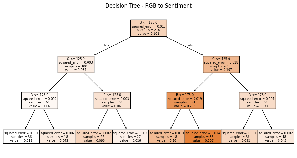
Decision Tree — RGB → Sentiment (MSE)
This regression tree illustrates how color channels (R,G,B) partition the dataset to minimize mean-squared error (MSE) of a continuous sentiment score. Impurity at each node is the sample's MSE; splits are chosen to reduce it.
Why MSE?
MSE penalizes large errors more than small ones, stabilizing the model against outliers and encouraging smooth partitions in color space.
MSE = (1/n) · Σᵢ (yᵢ − ŷᵢ)²ΔE Confusion Matrix → Quaternion Remake

Run the same nine classes through the Bloch-quaternion geodesic distance instead, and the picture doesn't confirm that ranking — it reorganizes it. Brown↔Orange, barely notable in CIELAB (ΔE = 79), becomes the single closest pair by a wide margin (4.0°). Black↔White, the most separated pair in CIELAB (ΔE = 162, the largest value in the entire matrix), collapses to 14.2° — among the closest pairs in quaternion space. Across all thirty-six pairs, the two geometries correlate at r = 0.07 — essentially no linear relationship at all.
That's not a failed replication. It's the geometry naming its own blind spot: this Bloch mapping reads hue as azimuthal phase, and phase is undefined for a color with no saturation. Black and white — achromatic by definition — have nowhere stable to sit on that dimension, so they drift toward the same pole regardless of how differently they read to the eye. CIELAB ΔE, built from lightness and chroma together, doesn't have that gap; this Bloch encoding, built from hue and saturation with lightness held separate as an interior radius, does.
So the honest finding isn't "nuance survives a change of geometry." It's narrower and more useful: each geometry is nuanced about a different axis of closeness, and neither is nuanced about all of them at once. A method that reports only the geometry favorable to its own argument would have quietly picked one and called it corroboration; reporting both makes the disagreement the point.
Pathways (11)
Each pathway is a repeatable trajectory through color space, built by hand — colors, sequence, and meaning fixed in advance. Below you'll find the color sequence for each, an image ("x pathway.png"), and a summary of the trajectory of movement.
Connections (17 Traversals)
The pathways above were fixed in advance. The seventeen connections below are the same kind of object read a different way: not a fixed pathway but a traversal, a sequence of colors moving from one felt state toward another — curious → thoughtful, drain → rise, toussaint louverture — run through the hidden-state RNN described in the Nuance Spine rather than assigned a static reading. Each image is the quaternion trajectory the sequence actually produces: real part, imaginary part, magnitude, and phase across the steps, not an illustration of it.
Toussaint Louverture
The strategy named after him runs through this whole page without having been stated once until now: engage an opposing view only to its midpoint — far enough to be heard by it, never so far as to abandon the health-centered position you started from. It's not conciliation and it's not refusal. It's a specific, disciplined distance.
The traversal that carries his name enacts this formally rather than describing it. Every other sequence in the Connections table moves from a starting state to a different ending state — curious to thoughtful, drain to rise. This one doesn't: black, red, green, blue, green, red — it leaves black and returns to red, passing back through green on the way. It's a cycle, not an arrival. Read against the strategy it's named for, that's not a flaw in the sequence — it's the shape of the strategy itself. Louverture's tactic was never to convert an opposing position into his own; it was to move partway toward it, hold there, and let the movement itself pull the other side closer. A traversal with a destination claims to have resolved something. A traversal that cycles back admits it's still in the reaching — a more honest formal match for a strategy that was never about winning the whole distance, only enough of it.
This framing comes directly out of my CU MEDLab Community Fellowship work on governance in Haitian maroon communities, and it's named explicitly here rather than left implicit.

Literature Review
Reading List of PDFs
Morphological grounding.Transdisciplinary Context
Risky behavior is framed as individual failure. Parents are expected to emotionally support their children with full financial obligations, with 46% of all new income from global economic growth since 1980 going to the richest 5%. We never catch up in our rest banks once we make it past childhood because care is an unrewarded commodity.
Deficit narratives sell. People would rather engage with what they know and like. We need designs that teach, rather than simply label.
People repeat lines as expected instead of creating genuine feedback. Even the people with the most power aren't free in their bodies. My family has achieved social mobility to the top 1% through immigration from Hispañola with education.
We are so constricted in our decisions with current social striations that our news is beginning to show wilder stories every day. Instead of teaching healthy decisions, current algorithms replicate all of our behaviors. Social stigmas are embedded in design from sourcing our histories.
Bucket sorting offers a linear model for time. We sort based on attracting what we like, and not what we learn from. Sorting allows for data intimacy.
Deterministic models of story forms that shape healing can preconfigure a pathway when data is missing using apophenia. Once the physical momentum is determined through one conformal metaphor, it is preserved through changed variables in the same category of sentiment, as determined by color. This is expressed through the significance of colors in the sorting of sentiment; word similarity of color vector to word vector is a significant correlation.
Just like spaces prescribe how we exist within them, contexts in stories carry when data variables change. Different cultures are partial to different story maps. Color sorting with story forms allows for transversal over a spatial map of sentiment to verify message with meaning.
Mobility through structural boundaries becomes unleashed. By creating intimacy with data, learning becomes more playful and comfortable. Sorting with 13 colors applies faith to action.
Self embrace from nullifying harm by enforcing consent is the way we swim in water. We feel our own selves when we touch the atmosphere, so we intuitively learn how to balance the connection with external harmony. Emitting and interpreting echoes, like a whale's echolocation, can help with navigational sensing.
Subjectivity is always contained in objectivity because subjects can never be removed from their objects. All color interpretations are valid, and meaningful. There is a circular gradient of meaning for complimentary opposites.
Sorting with 13 colors rejects the null hypothesis. By removing precision on labels, access becomes inclusive. Our perspectives become revealed by our choices in labeling, rather than projecting forward.
Data intimacy through play with color bucket sorting can increase access to care. I dedicate and offer this work to stewards of land and body safety. A prayer for co-liberation.
Sources
Alonso-Sanz, R. (2015). On quaternion maps with memory. Complex Systems, 24(3), 223–233. https://doi.org/10.25088/ComplexSystems.24.3.223
Benjamin, R. (2019). Race after technology: Abolitionist tools for the new Jim code. Polity.
boyd, d. (2014). It's complicated: The social lives of networked teens. Yale University Press.
Christian, B., & Griffiths, T. (2016). Algorithms to live by: What computers can teach us about solving human problems. Henry Holt and Company.
Costanza-Chock, S. (2020). Design justice: Community-led practices to build the worlds we need. MIT Press.
Federici, S. (2004). Caliban and the witch: Women, the body, and primitive accumulation. Autonomedia.
Hickel, J. (2020). Less is more: Economics for the age of climate change. Penguin Random House.
Ingersoll, K. A. (2016). Waves of knowing: A seascape epistemology. Duke University Press.
Klein, L. F., & D'Ignazio, C. (2020). Data feminism. MIT Press.
Noble, S. U. (2018). Algorithms of oppression: How search engines reinforce racism. New York University Press.
Surov, I. A. (2022). Unified space of emotion and color. Frontiers in Psychology.
Zohar, D. (1989). The quantum self: Consciousness, physics and the new world view. Bloomsbury.
Zuckerman, E. (2013). Digital cosmopolitans: Why we think the internet connects us, why it doesn't, and how to rewire it. W. W. Norton & Company.